Art Critic
I’ve been to the Laing Art Gallery in Newcastle.
I’ve been there before, and when I go, I tend to just amble round the paintings, only vaguely looking at them while I wait for something to catch my eye and then I’ll stop and look at that particular painting for a while, reading the information about it and trying to see it in different ways.
I don’t view a painting (or a sculpture, or exhibition) as something I’m supposed to get something specific out of; I don’t care what the artist intended. It’s my perception of it that makes it good art or not: because ultimately that sort of decision must be subjective.
Today however, it was the art criticism which rather caught my eye.
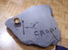
There was an exhibition called Water Memory, in which "…Song Dong writes his diary in water onto flat stones, which then dry and the characters disappear.". Only in this particular case, the curator pointed out that the exhibition has been great fun for the kiddies, only obviously one person wasn’t too impressed, having scrawled the word ‘crap’ across the stone with the water left to paint on it.
Some of the other stones were covered with larger, illegible splodges of water. I’m guessing said art critic had taken the time to draw some crude representations of male genitalia, which the gallery staff had decided were a little too indiscreet to leave in place. But that’s just my working hypothesis.
(In case you’re wondering, I specifically asked permission to photograph, and was told that as long as I was photographing just the stones and without using a flash, then it was okay — flashes were right out because some of the old paintings in the gallery (200+ years old) were obviously very fragile and easily damaged by strong — and particularly UV light.)
In the next room to this there was an exhibition called Gone with the Wind, showing a Kittiwake seemingly in flight, surrounded by thousands of flower seeds (of the windblown ‘fluff’ variety) hanging in the air. These are positioned so as to give a fantastic sense of movement; as if the positions of the seeds have been disturbed by the flight, rather than carefully arranged. Also, as an added bonus, at one end of the gallery, the lights reflected from the fibres suspending the wires quite beautifully giving the impression of layers of light suspended within the exhibition…
Then of course there are my favourite paintings. There are three paintings I particularly remember:
- John Martin’s The Bard, which gives a fantastic impression of depth, of distance, and almost being able to feel the wind whistle around…
- A second by John Martin, this one showing The Destruction of Sodom and Gomorrah, simply because of the great fiery colours, and the way the cities seem to crumble into a fiery pit
- Then there’s one by Daniel Maclise, obviously not a fan of snappy, punchy titles, with his Alfred the Saxon King (Disguised as a Minstrel) in the Tent of Guthrum the Dane. Notable for me because the first time I saw the painting, I thought ‘that guy in the middle with the harp looks suspicious, he’s up to something’ and then read the title, and realised how well the artist had made that character stand out from the others, looking more alert and well, frankly more shifty-looking…
There was another called Ben Nevis I liked, and another beside it I liked even better but haven’t been able to find online (possibly because I can’t remember much about it, other than ‘it had a lot of green countryside in, and I liked it’).
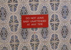
But the most unusual sign has to be the one I found in the Gents lavatory. I’d just like to clarify here: I don’t normally take photographs in the gents lavatory; I’d imagine it would make people somewhat uncomfortable and may result in severe bruising and/or being asked to leave certain premises. However, in this case the sign was unusual and there was no-one else in, so I judged it worth the risk…
It simply read “do not leave baby unattended at any time”.
Baby? What baby? Looking around the gents toilets, there were a couple of toilet cubicles, a couple of urinals, and a couple of sinks. Nothing else. No baby-changing facilities. No mats, nothing like that.
And for those of you who have not yet experienced the joys of parenthood, let me assure you that it is not common practice to place your babies in a urinal while you go for a wander around an art gallery. Nor can babies be expected to use toilet facilities by themselves. So why the sign?
One can only presume that the gallery is sick of calls from slightly harrassed fathers…
…yeah, listen, you’ve not had a baby handed in, have you?
Yeah, a baby. Yes, a real one…
No, only I came to the art gallery before, you see, and I’m sure I had the little ‘un with me, and I reckon I must have put him down somewhere…
…or maybe it’s just that the staff are worried about an unattended baby ‘going off’, showering the vicinity with high-velocity milk and poo?


 Hello. I am