ThePickards Design History
Well, I’ve been here before and showed the various site designs for ThePickards back in February 2007. However, as that was more than two years ago, and I’ve launched a new design since, I think I’m allowed to be self-indulgent once again.
So, to begin, ThePickards has existed as a domain since around March 2005, when I decided I wanted my own website, to discuss web design and best practice things. However, I did absolutely sod all about getting my own site going for a while.
Then, in November 2005, the people on AccessifyForum arranged a meetup in Manchester. I believe a fun time was had by all, once we’d had all separately worked out that the place Redux had suggested we all meet up didn’t actually exist and just wandered around looking for people who looked like a gaggle of geeks. They were surprisingly easy to spot…
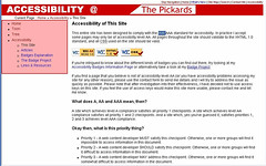
But I wanted to write up what I termed the AcFo Expo Manchester 2005, so I felt the need to start writing these things up as a blog, for which I used the Blogger engine. However I showed that my graphic design and css skills were not particularly great back then.
Initially, my plan was to write long articles on a number of things, and drop them into the appropirate category on the site — whether they related to my family tree research, whether it related to web design and accessibility, or whether it related to Newcastle United. At this stage, each page (other than the few ‘blog’ pages) was hand-built.
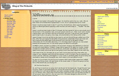
A couple of months later I came up with the first thing that I actually think deserved to be classified as a design. It was also at this time that I decided that rather than having a lot of separate sections, I’d keep most of them in the blog, with only the family tree and ‘articles’ having their own separate sections.
This design was supposed to have the vague feel of a desk, with the left hand navigation an envelope; the right hand links being found in post-it notes, a ruler across the top, and a torn-off sheet of paper holding the content. I still don’t think it’s actually bad, and I have quite a soft spot for it.
However, when I decided to move over to Wordpress in the middle of 2006 (because at the time, Blogger would not allow me to categorise posts), I needed to find a new design as Wordpress and Blogger used entirely different templates and so on.
Initially I used a wordpress theme called Connections (now updated and widget ready), but this didn’t really suit me, and I was quite attracted to Mike Cherim’s Seabeast theme, as this offered an accessible 3-column layout, which was something I wanted.
I tinkered with Seabeast quite a bit, in terms of changing the colours, changing the fonts, changing the images and so on, but it was still very much Mike’s structure powering the whole thing. This also saw the first usage of ‘the web chemist’ character which I sometimes use as my internet ‘alter ego’. Although I don’t think of him as the web chemist now, he’s just me, in mad scientist guise…
This is the theme which will probably seem most familiar to you all: given that this has been the theme which has been in use since July 2006 until very recently, this theme has been in use for (at the time of writing) over 80% of the life of this blog. It’s therefore served me very nicely.
However, as I said the other day, I was looking to have a play with Wordpress widgets and the Seabeast theme wasn’t widget-ready, I needed to find a new theme. But I didn’t want to change my ‘identity’ too much.
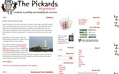
So that’s why I came up with this, with the same basic colours and so on. I’m not going to bang on about the new design too much, as I covered that in more detail the other day, but I’m obviously including a picture of it here so that at some unspecified future point, if I change the design again, it will be easy to view the design history.
Although I didn’t note the fact that it was called the seawater theme. Given that I had used the seabeast theme before, I realise that there is a distinctly nautical theme to the er… themes I’ve been using for this blog.
So maybe you should watch out for the “seaside” or “sea urchin” themes appearing some time in 2011…


paul canning says:
April 19th, 2009 at 2:03 pm
Yes, geeks are surprisingly easy to spot. Takes one to know one I guess. But like gaydar!
One thing I should have said before which I dislike about your new design is that you’ve dropped ‘recent posts’.
If I (or someone else) come in on a post that’s a useful thing to see, and useful for you too as it draws traffic to other pages.
On my blog I find this isn’t a huge number - maybe 5%. But as a user I’d find it useful.
paul canning says:
April 19th, 2009 at 2:05 pm
Bit like gaydar!
JackP says:
April 19th, 2009 at 8:29 pm
Paul - recent posts returned. Right hand column, near the top.
Jack's Mam says:
April 19th, 2009 at 11:04 pm
I’d been meaning to say I missed the ‘recent posts’ link, glad its back !